ECHT.
GUT.
PULLE.
To establish itself in the retail sector, Pulle requires a revamp of its existing corporate design, which was initially created in a provisional manner by the company itself but serves as the basis for the redesign. However, being a young company, Pulle has limited funds available for marketing initiatives such as regular product photoshoots. Additionally, the brand's different values, including regional identity, social engagement, and groundedness, should be highlighted. The following points need to be developed
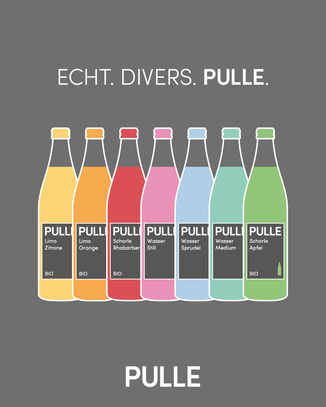
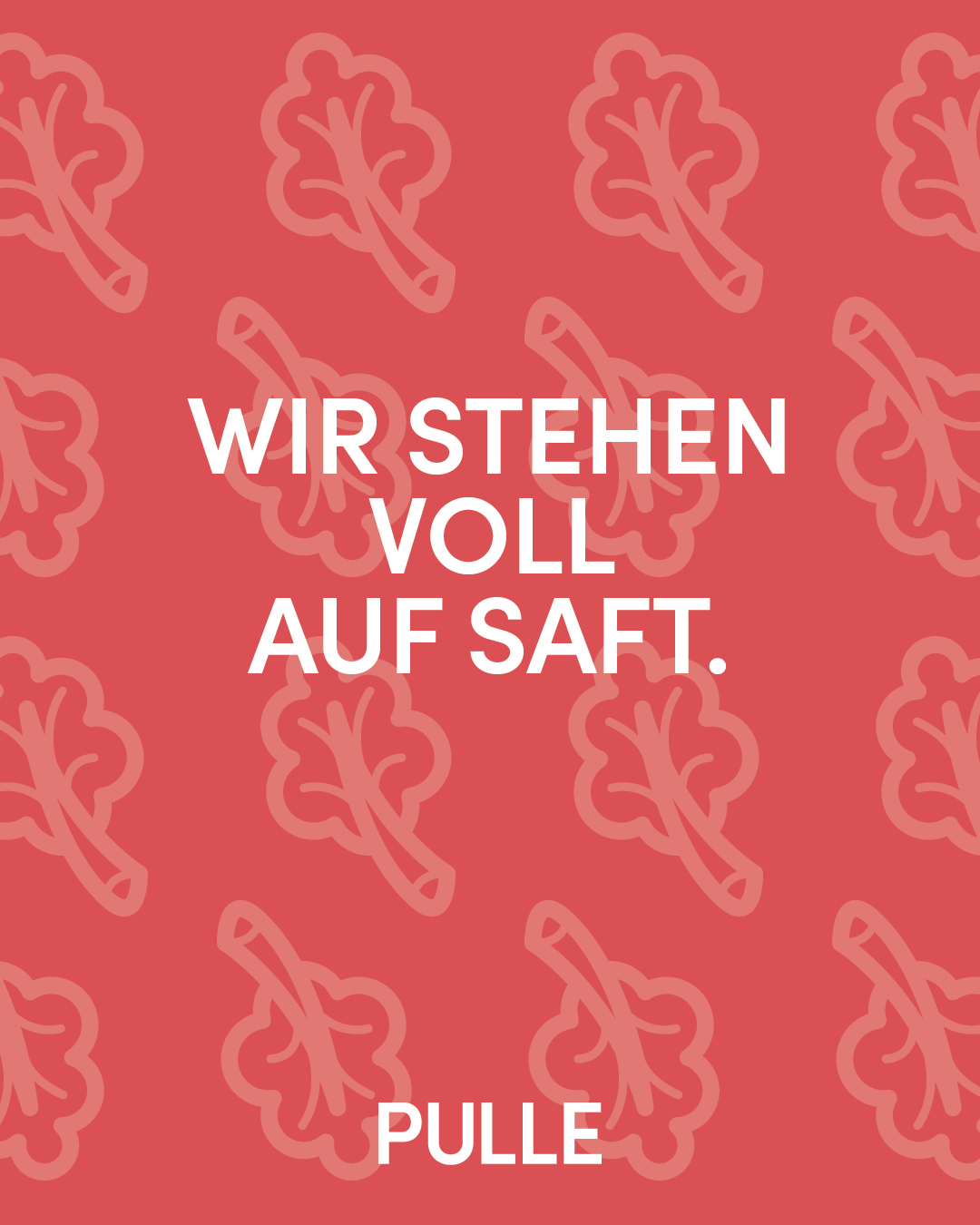
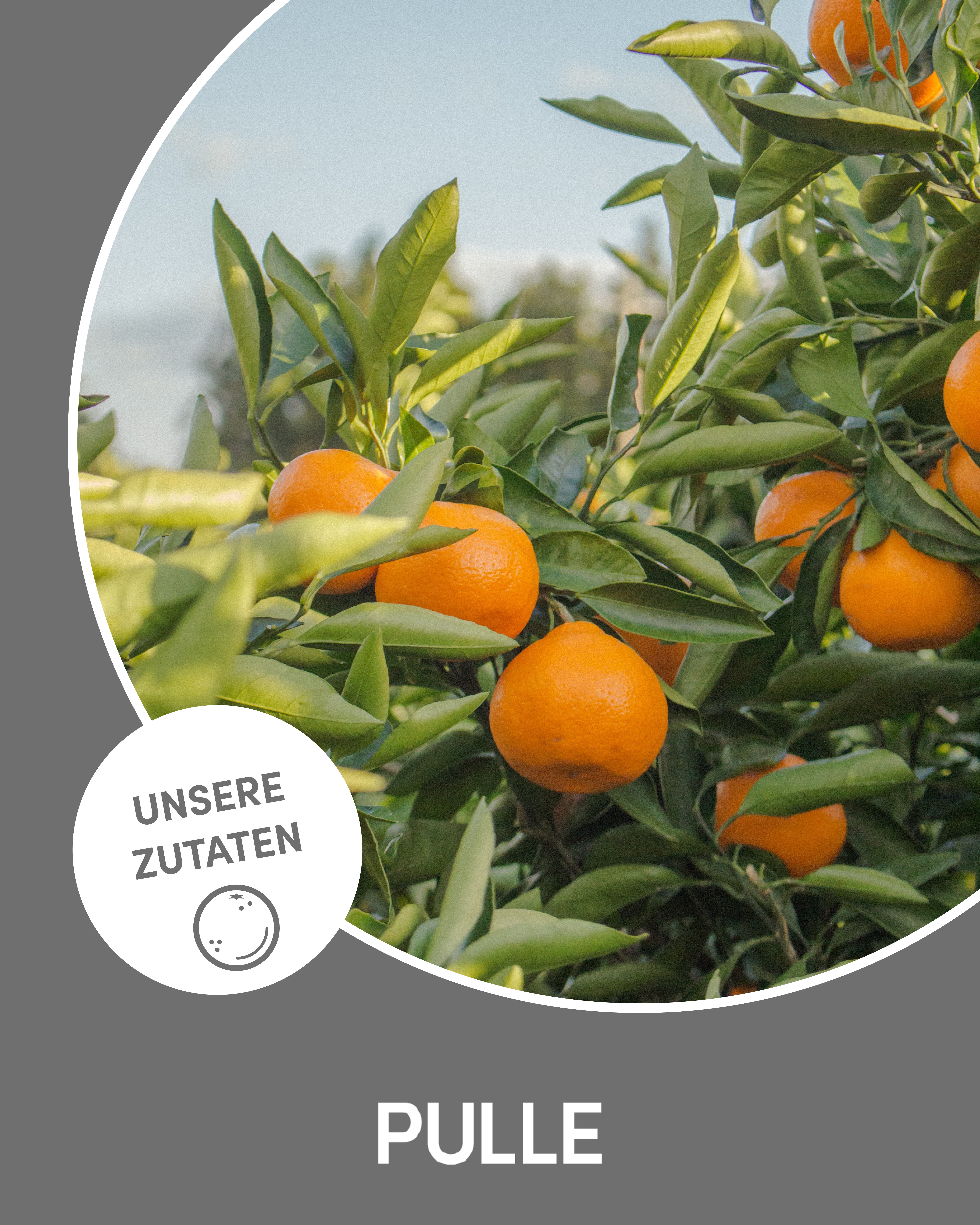
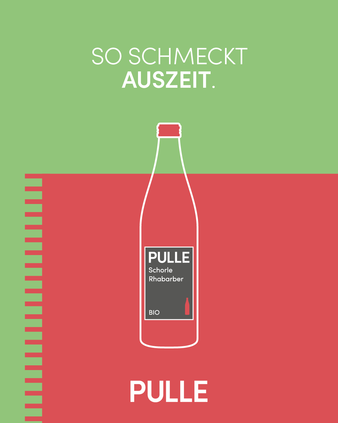
The design captivates with its minimalist aesthetics, allowing products and messages to take center stage without any unnecessary frills, just like the product itself. The tagline "Echt. Gut. Pulle." (Real. Good. Pulle.) perfectly reflects this approach and can be easily adapted and applied within the broader brand communication campaigns. To reduce reliance on elaborate product photoshoots and make visual assets easily adaptable, the concept utilizes product illustrations that brand each variety separately with distinct colors. Complementary icons are used to highlight ingredients or introduce more visual dynamism through patterns. Additionally, a dedicated Linktree is set up to provide quick and easy access to more comprehensive information about the product via a QR code.
Do you already have a project in mind where I can assist you? Great! Tell me more! For that, please feel free to use the contact form.